Skip to content
Jun 28 / Shanan Delp

Polishing our Profiles

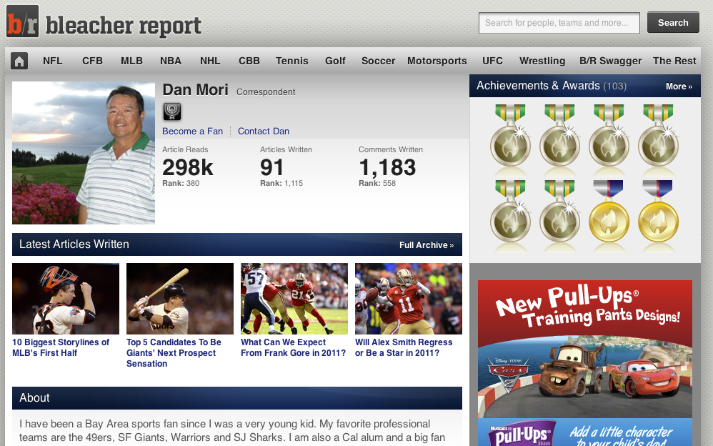
Quick weather report: it is raining cats and dogs in San Francisco today, and in other news we have launched an upgraded design of our Bleacher Report writer profiles. Head over to your profile to check it out.

This new design ties the profile page more closely in with the rest of our site, and gives space to introduce new capabilities to this page (which we’ll be doing in the next few weeks– stay tuned).

As always, let us know what you think.

  • Anonymous

    Ehhh, it’s alright. I liked the old one better personally.

    Maybe the new features will be worth it.

  • Andrew Barr

    I am a bit concerned with the “last articles written” section. It used to be I could look at how many reads each of my last four articles had. I enjoyed that because I often write multiple articles a day and I like being able to see how each one is doing without having to click them individually.

    I also liked being able to see precisely how many total article reads I had, instead of rounded off to the nearest thousand, but that I can live without.

  • Adam Fromal

    Like Andrew, I liked being able to see the stats on the most recently published articles. But that’s not my biggest problem with the changes, most of which I like.

    I really really don’t think that the newsfeed section should have been pushed aside. The ability to see previews of comments below the last articles written section was invaluable and let me immediately know what kind of comment I was getting. Just seeing who commented on which article isn’t helpful at all.

  • Scott Harris

    It looks good, but there seem to be fewer analytical tools for writers. I am no longer easily able to check in to see how many reads my recent articles are receiving, and am also unable to check the substance of recent comments written. In order to do either of these things, I now must go into each individual article one at a time rather than having all that information available at a glance.

    In short, I was able to use my old profile as a kind of dashboard for all my B/R writing activities. It no longer seems quite as able to serve that purpose.

  • Bill N

    I also do not like the fewer stats. I didn’t see anything wrong with the old format, but the new one is OK if all the stats we had access to before are added back.

  • Andrew Barr

    I’m having another big issue with the changes made, though it’s not about the profiles. On the Top Writers page (http://bleacherreport.com/mma/top-writers) I can no longer see my exact figures, nor anyone else’s.

    At the beginning of the month I put forth a goal to reach a certain amount of reads and now I am unable to see how close to that goal I am, or if I have already achieved it.

  • http://twitter.com/Mktimeforsports Make Time For Sports

    It would have helped to have the number of reads appended to the latest articles. Thanks.

  • Max Minsker

    I definitely like the old layout better.

  • Jon Sainz

    I liked the old one better, with this is harder to know if someone responded to a comment.

  • Bobby B.

    Have to post the stats for each article, like the old format, if this new format is going to be effective.

  • http://twitter.com/Schottey Michael Schottey

    I think a lot of people here have been using their writing profile as their writing HQ–that is GREAT, because that’s how B/R was set up. However, now the profile is actually a profile–an outward facing, clean representation of the author and his work. Many of the analytical tools mentioned below can now be found in the HQ. (I do agree with the comments in the newsfeed, though!)

    • Scott Harris

      I agree that profiles should be clean and “outward facing,” but on further review I’m not sure that’s entirely accomplished either. The bio and short list are now harder to read, and some of the longer bios are cut off, while the seldom-used bulletin board takes up half the screen. I also believe that aesthetics and functionality need not be mutually exclusive, especially given that, in all reality, a profile’s top visitor is going to be the author him or herself.

      Basically, the profile may look a bit better, but it is now harder for a writer to monitor articles. Meanwhile, basic writer tools and services, like creating slideshows, remain difficult and not-problem-free. Would be great if B/R made things a little easier, rather than harder, for its largely volunteer writer workforce to get things done.

      Sorry to vent like this, but I do have some concerns about this (can you tell?) and wanted to air them. I probably felt the need to do this because of the affinity I have for the site and its many contributors. Thanks very much for providing this forum for feedback!

  • http://www.facebook.com/people/Kevin-McGrady/100000478795907 Kevin McGrady

    Interesting, but not as functional would be my opinion of the change so far.

    I have never been interested in statistics, but it appears some are. They should be added back into the scheme.
    It is very difficult to follow comments and answer them on various articles now. I think this is a grave mistake that will make the site less enjoyable for readers.

  • http://twitter.com/dioselev Dmitriy Ioselevich

    I personally don’t like it. My biggest issue with it is that it’s incredibly tedious for high-volume writers (which I assume most of us are) to track and reply to comments. One of the greatest things about B/R is that it encourages dialogue between readers and writers, but you destroy that dialogue if you make it this much harder for writers to interact with their readers.

  • Anonymous

    Hey everyone, thanks for the feedback– we really value it. We’re working to bring back the read counts to the recent articles, as well as provide you with more detail about recent comments on your articles. I expect that you’ll see these restored in the next day or so.

    • Scott Harris

      I was among the complainers, so I definitely want to be among those offering a big thank you!

      I just took a look and the elements in question seem to be fully incorporated, without compromising (and perhaps improving) the look of the new profile. Excellent work and a tip of the cap to all involved….thanks so much for your hard work and your responsiveness.

  • Eitan Katz

    Just a suggestion.

    Why don’t we keep the NEW profile for when someone looks at our writer page.

    BUT when we are logged in, we see the old profile page (which was clearly better for us).

    That way, our readers will have the clean, new profile, and we will have the writer-friendly profile.

    What you think??

    • Eitan Katz

      Is that even possible?

  • Sdelp

    Quick update everyone, we’ve update the profile pages fix a couple of the issues that you reported: you can now see reads on your most recent articles, as well as more detailed information about comments in your recent activity feed.

  • Ross Rutherford

    Not crazy about the design if I am being honest. I don’t like how you put the writer’s stats above their published work. The focus should stay on the reader finding the writer’s work and not reading their rank on the website. A typical reader really won’t care….

    That is juts my opinion. Really proud of how far I have seen this website come in the over 3 years that I have been here. Change is good, but this seems like a downgrade from the old profiles.

    For some reason I’m not alerted on my page when someone “likes” or responds to my comment on an article that isn’t mine.

    This bothers me as I therefore can’t respond as well as I would like to because I’m not aware anyone commented me back in the first place.

  • Danny Flynn

    I like the old one better but the new version’s not too bad. It’s just going to take some getting used to.

    My only major gripe is that the bulletin board takes up so much of the page.

    I’ve always figured the BB was the least important part of the profile. Honestly, I forgot there even was one.

    My suggestion would be to switch the space where the BB is and have it show the most recent comments on articles, like the old version of the profile did.

  • Pc Nick

    Why dont my comments show up in my profile sometimes? Also I can no longer see replies that are made.