Skip to content
Aug 2 / Shanan Delp

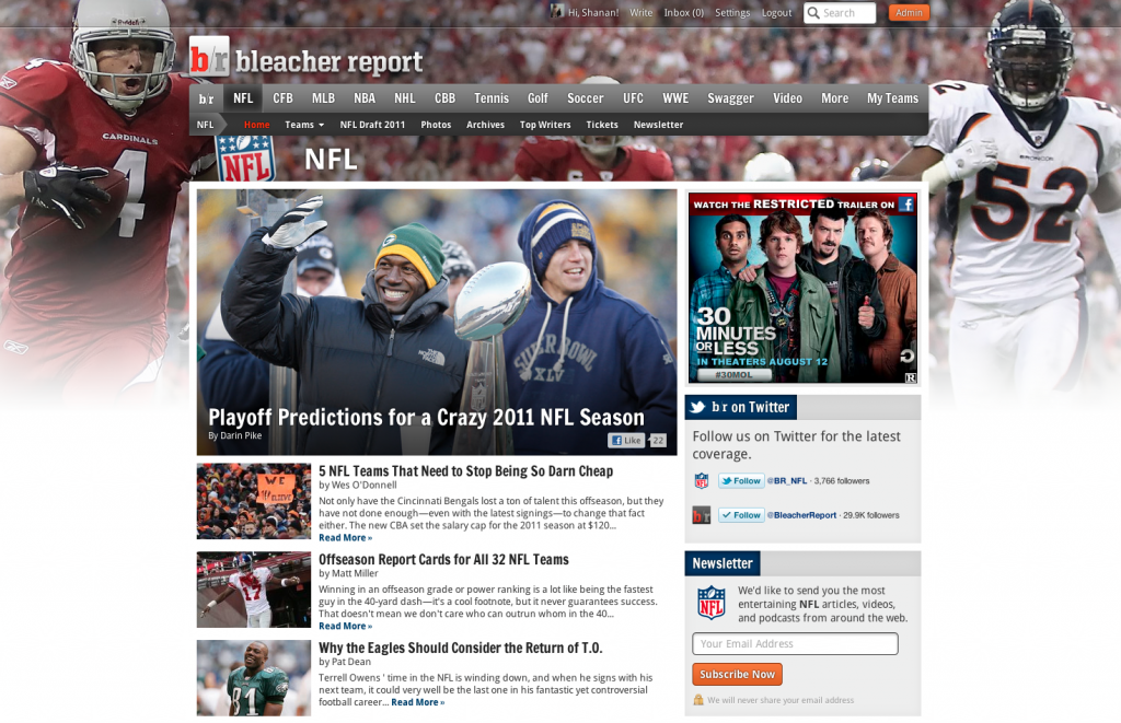
Gearing Up for football: A B/R redesign

Around Bleacher Report HQ, a lot of meetings end with us agreeing that “it needs to be done by football season.” Football season looms large in our imaginations, sort of like Christmas looms in the minds of 5-year-olds.

Today, we’re launching the first of a few of these football season-oriented projects, a redesign to the look and feel of Bleacher Report. It’s subtle, but we think the site looks more contemporary and easier to read and browse. And we think it does a better job expressing some of the personality and fun of Bleacher Report. Give it a look around and let us know what you think.

Things to look out for:

  • A cleaner design, with sharper fonts.
  • For fans that have personalized their Bleacher Report experience, we moved “my b/r” to the main navigation and changed its name to “my teams.”
  • We worked to make the site easier to navigate for folks on tablets. There’s more to come on this, so stay tuned.

There’s a lot more that we’re working on, so look to see more improvements to the site in the next few weeks as we move toward football kickoff.

  • http://www.facebook.com/EitanDKatz Eitan Katz

    Looks awesome guys! Love the sharp new font—makes the writing look less like a school paper and more like a sports-article!

  • http://twitter.com/RickBrokaw Rickbrokaw

    Great new look. Love the layout, the background, the font, everything!

  • Carl

    Everything looks great!

  • Danny Flynn

    It looks 10 times better!!!

    Really amazing job by the design team.

    Perfect choice for the main font. It’s so much more crisp.

  • Brandon

    The new format does not allow for tables in articles. I just saw one and it is a mess. Definitely a kink that needs fixing.

    • http://twitter.com/shanand Shanan Delp

      Brandon, can you send me an example?

  • Verda

    Your page looks good! The new font and the white borders [as you scroll down] add straightforwardness and clearness to the website’s over all appearance. I like it.

  • Linus Fernandes

    Love it.

  • http://giantspod.net Daniel Zarchy

    I like it. I was having a problem before that I couldn’t read article while I was logged in. As a writer on BR, you can imagine that that was a problem.

    But now it’s fixed! Good job.

  • http://www.facebook.com/profile.php?id=100000271597679 Mitch Hubble

    Awesome work guys, it would be great if writers could have a personalised spot on their b/r homepage so they can see an overview of how they’re doing :)

    • http://twitter.com/Schottey Michael Schottey

      I believe what you’re looking for is on your “B/R Dashboard” …remember, the profile is meant to be an outward representation of you to your readers. The dashboard is meant to be your personal “landing spot.”

  • Charlie Melman

    Put the Top Writers back on the home page for each team and sport! I hate going to the Top Writers tab at the top because those rankings are always old and I have no idea where I rank. Either get your act together with updating the rankings (on Arsenal they’re a day old!) or put Top Writers back on team and league home pages.

    • Matt D

      I want to echo Charlie’s statement – I loved coming to site to see who the most active writers were for each team. I would use that to go look at all of the articles. Not having it on the team home page is not good.

    • http://twitter.com/shanand Shanan Delp

      working on this

  • scott harris

    I think it looks terrific…especially like the drop cap at the beginning of each story. Great work!

  • Nick Caron

    One suggest I might make…

    How about highlighting which users are making the most COMMENTS in each section? This would be a way for our readers (specifically “active” members) to get some props, too.

    I don’t know if this is something we want to do or not, but I think it could help generate more comments on our articles if people are seeing their picture on their favorite team/sport’s page.

  • Brandon Pledger

    Love it!