Choosing the right picture for your story
Selecting an image for your article shouldn’t take you 10 minutes, but it should definitely take you more than 10 seconds. A bold, rich image can really have a huge impact on the number of clicks your article receives.
When building a newsletter, I think very carefully about the image I’m selecting. A story about Mike Vick landing a $100 million contract isn’t going to look good with an image of him getting sacked. How about a shot of him in prison garb? Think again. I’m looking for a tight image of his face, showing off those pearly whites. See, that’s better.
I’ve broken down image selection into a few simple tenets. Following these instructions can result in a big boost in the number of clicks your article gets.
1. Quality control
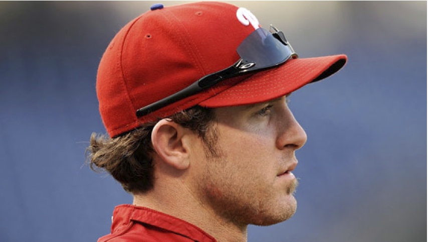
Above all else, you’ve got to be sure to use a high-resolution image. A grainy, pixelated image like the top one of Chase Utley at left will draw a reader away from even the most compelling topic. (You can’t really see the difference at this size. Click these and all other photos in this post to see them at full size.) If you want your story to get featured prominently on the front page, a league page or a team page, it has to have a picture that will look good in a large format.
2. Tight area of focus
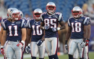
Yes, we all love beautiful, wide, sprawling images in all their glory. Unfortunately, they don’t have much of a place on our site. A wide or busy photo will confuse the reader, and his or her attention will quickly divert elsewhere. If your story is about Chad Ochocinco, don’t use an image of the entire Patriots receiving corps. Show me Ocho, up close, with all those teeth. That’s more like it.
3. Story-specific
You always want your photo to sell your story. If your image and headline match up, the reader is much more likely to give you that click. You’ve got a story about the worst Raiders draft picks of all time? I’m thinking an old-fashioned depressing picture of JaMarcus. Done.
4. Bright is best

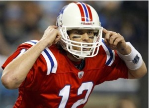 Lets talk colors. Always, and I mean always, use the brightest colors possible when selecting an image. Often, it’s as easy as finding a great picture of an athlete in a throwback jersey. Yes, most throwbacks are ugly, and there’s a reason these teams stopped wearing them. But they still have a place: our front page. A bold, bright color is going to pop no matter what the rest of the page looks like.
5. Face time
Readers don’t want to see hats or helmets. They want to see a face. Period. Take another look at the Chad Ochocinco pictures above. Sure, there are going to be exceptions to this rule. Hell, there will be exceptions for all of these rules. But faces bring clicks. It’s science (well, statistics).
6. Emotion sells
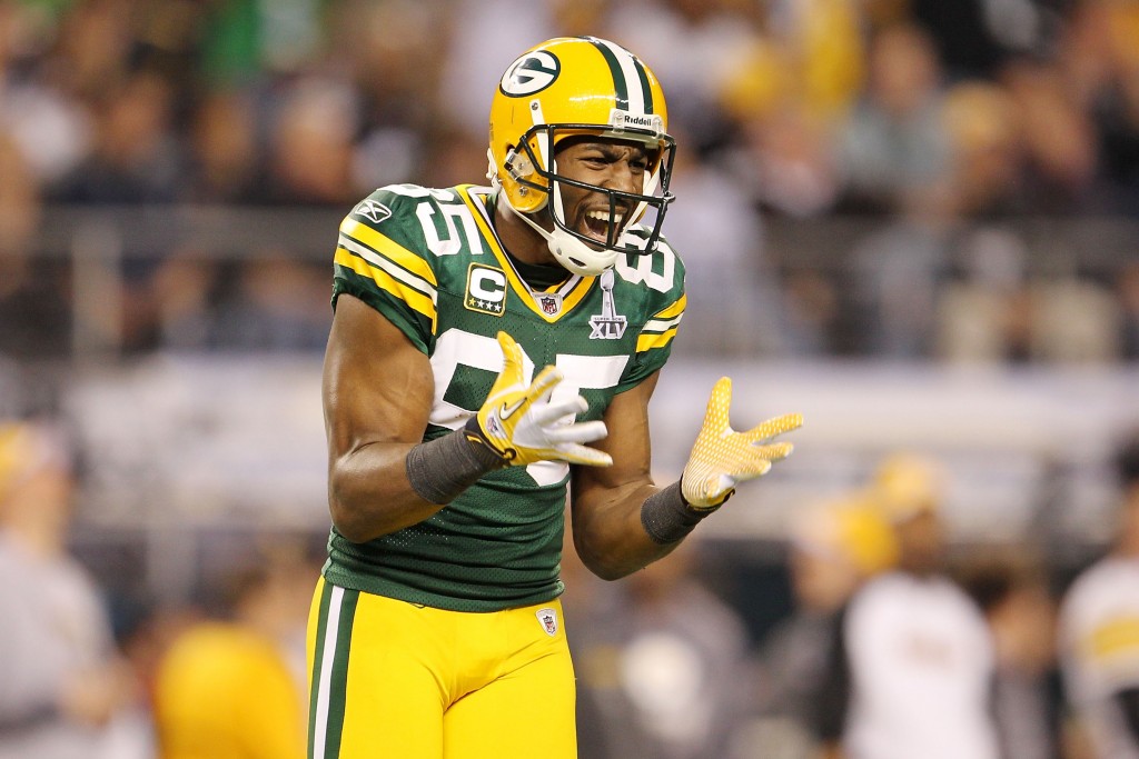
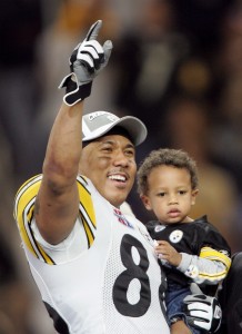 Yes, athletes are human. I know: Sometimes it’s hard to tell. Especially when watching the Phillies (sorry, had to throw that in there). So let’s show the reader that emotion. Readers really do respond to images in which an athlete is letting it all hang out, so to speak. Got a DUI story on Hines Ward? Let’s not use this post-Super Bowl XL celebration picture. I’m thinking a picture from the Super Bowl XLV loss.
7. Keep it clean
With very few exceptions (B/R Swagger, chiefly), Bleacher Report has a strict policy when it comes to sexy photos. As a writer, you must remember that our stories don’t just show up on BleacherReport.com. They’re on our partner sites as well. So unless you’ve got the go-ahead from an editor, err on the side of caution and play it safe.
8. Think like a reader
When searching for the perfect image, put yourself in the shoes of a B/R reader. What would give you the incentive to click? And if you aren’t sure, get a second opinion. That’s what G-chat is for.
There are going to be times when you’ll have a perfectly good reason to break the first seven rules, and that’s OK. But whatever you do, don’t break this one.
Remember: An image is just as important as text, as far as a reader is concerned. So take the extra time to ensure you’re picking the perfect picture. It will pay off.
Comments are closed.




Pingback: Journalism’s Future | J Messing