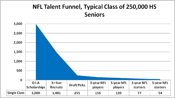
Step by step: How I created a visually compelling graphic

The B/R Blog asked Ty Schalter to explain the nuts and bolts of how he created this graphic in a story about NFL linebacker Nic Harris.
The kernel of the idea for the graphic in the Nic Harris story actually came from my daughter’s figure skating; a USFS official told me that there are over 100,000 kids in the “basic skills” level and about 114 international/elite skaters … so about 1:1,000 kids who ever skate a competitive program make it to the top level.
So, I gathered up each of the figures I’d need: how many high school seniors every year play varsity ball, how many kids get offered every year, how many kids get rated as a three-plus-star recruit, etc.
Then I dropped the labels and the figures into two columns of a Microsoft Excel spreadsheet and highlighted them.
I wanted to show a value (players) that changed over time, so I went to the Insert tab and picked a 2-D Area Chart. I could have made it a little snazzier with 3-D—and arguably should have used a Bar Chart to more appropriately represent discrete totals—but I wanted to visually emphasize the funnel, how it tapers from a huge mouth to a tiny sliver.
Once the chart is dropped in, a series of tabs pops up called Chart Tools: Design, Layout and Format. Under “Design” there are several chart layouts that change the presentation. I wanted the values labeled clearly and the raw numbers included, so I picked a layout that did that.
I had to tweak the grid and labels to fit nicely. I played with the font size and styles to improve readability and flow. As I suspected, there was no way I could include the 250,000 figure of “all high school seniors who play varsity football” without using a logarithmic Y-axis (which would jack up the funnel, ruining the whole point), or making every other value practically invisible, so I just started with the next value and included the 250K figure in the chart title.
Using the drag-and-drop scaling tools, I re-sized the chart and chart area to play nicely with B/R’s media aspect ratio, then copied the chart to the clipboard. I opened my chosen image editor (the GIMP) and pasted it as a new image, then scaled/cropped/etc. until it would fit nicely on the page. I saved it off as a high-quality .PNG, and during composition uploaded it to a media slot.
* * *
Ty Schalter is an NFL Lead Writer.

