Give readers the whole picture: Best use of multimedia assets
Selecting high-quality multimedia assets can differentiate a good article from a great one, but it’s a step in online publication that often goes overlooked as writers rush to keep up with the daily news cycle.
Even Bleacher Report’s highest-visibility content—articles that funnel through the B/R front page and CNN sports module—regularly have multimedia elements added, replaced or taken out during a quality review.
As a content producer for B/R, when selecting multimedia assets to complement textual analysis, there are several questions worth asking to ensure an engaging reader experience.
Note: At B/R, we define images, GIFs, videos, tables, infographics and polls as multimedia assets.
Question: Do all of my multimedia assets sync with my narrative?
This is the big one. Multimedia assets can strongly accentuate an article’s narrative with appropriate selection and placement.
If a key event is referenced in-text, try to find an image or video of that event and have it placed next to or directly below the reference. Actually seeing visual evidence of something that happened is much better than reading a description of it, no matter how eloquent.
If the event did not have pictures taken on-scene, make sure the images you select are as accurate as possible in terms of appearance (jersey color, hair style, etc.).
If a key figure is introduced, it never hurts to include an image, particularly if the person isn’t well known by casual fans. If there are multiple key figures in a story—the headline usually gives this away—try to feature all of them in the primary image. And never be afraid to identify these figures with captions, particularly if a reader might be unclear as to who’s who.
Finally, your multimedia assets should reflect the tone of your analysis. For instance, if your narrative is upbeat, make sure all of your images reflect that (smiling faces, high-fives, etc.).
Question: Am I using enough multimedia assets?
For standard articles, only one secondary multimedia asset is required, but it’s typically beneficial to include more.
While there are no strict rules as to how many multimedia elements are required per number of words, sentences or paragraphs, a piece is likely to look dull if it’s all text for much more than one computer screen’s worth of the article.
Of course, this is just a rough guideline to make it easier to eyeball.
At the same time, there can also be too much of a good thing. One multimedia element per paragraph, for example, would be too much. Avoid stacking, and space your images out evenly.
Question: Am I featuring a variety of multimedia assets?
Secondary images are great, but for more lengthy standard articles, try to mix it up with a video, table, infographic and/or poll.
Readers are more likely to finish reading articles with a variety of multimedia engagement, whether that’s through hearing the voices of central story figures or fellow expert colleagues (videos), analyzing a statistical comparison (table/infographic) or answering a compelling question (poll).
Question: Do all of my images/GIFs/videos appeal to the senses?
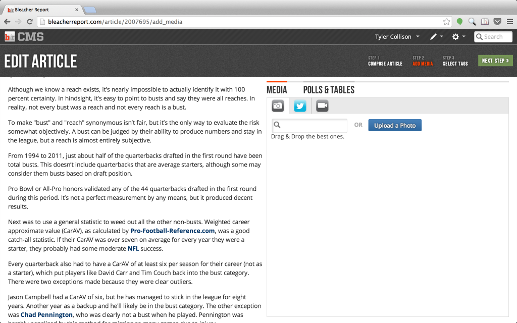
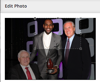
All images should be bright and focused. For the latter, a cropping tool is built-in so you can zoom in on a particular part of any image. Some images might look fine without being cropped, but the majority of them look much better after being framed manually.
GIFs and videos will probably not show up in as high a resolution if they come from a third party, but you should make sure all key actions and key figures are distinguishable.
For videos specifically, make sure the commentary is audible.
Question: Did I thoroughly scan all of my image databases?
Try to make use of all image databases (AP/Getty/Presswire) at your disposal. Some events may be covered by more than one database, but that doesn’t mean one didn’t do a better job securing high-quality images.
Similarly, if one set of images doesn’t deliver on exactly what you’re looking for, keep scrolling until you find the right fit. Bottom line: Don’t just pick the first option placed in front of you.
See also: Multimedia Assets: Chapter 16 of of Playbook: The Basics of Writing for Bleacher Report. Download the full textbook free at this link.
* * *
Matt Connolly manages Bleacher Report’s Quality Editing team.


